

Project Brief
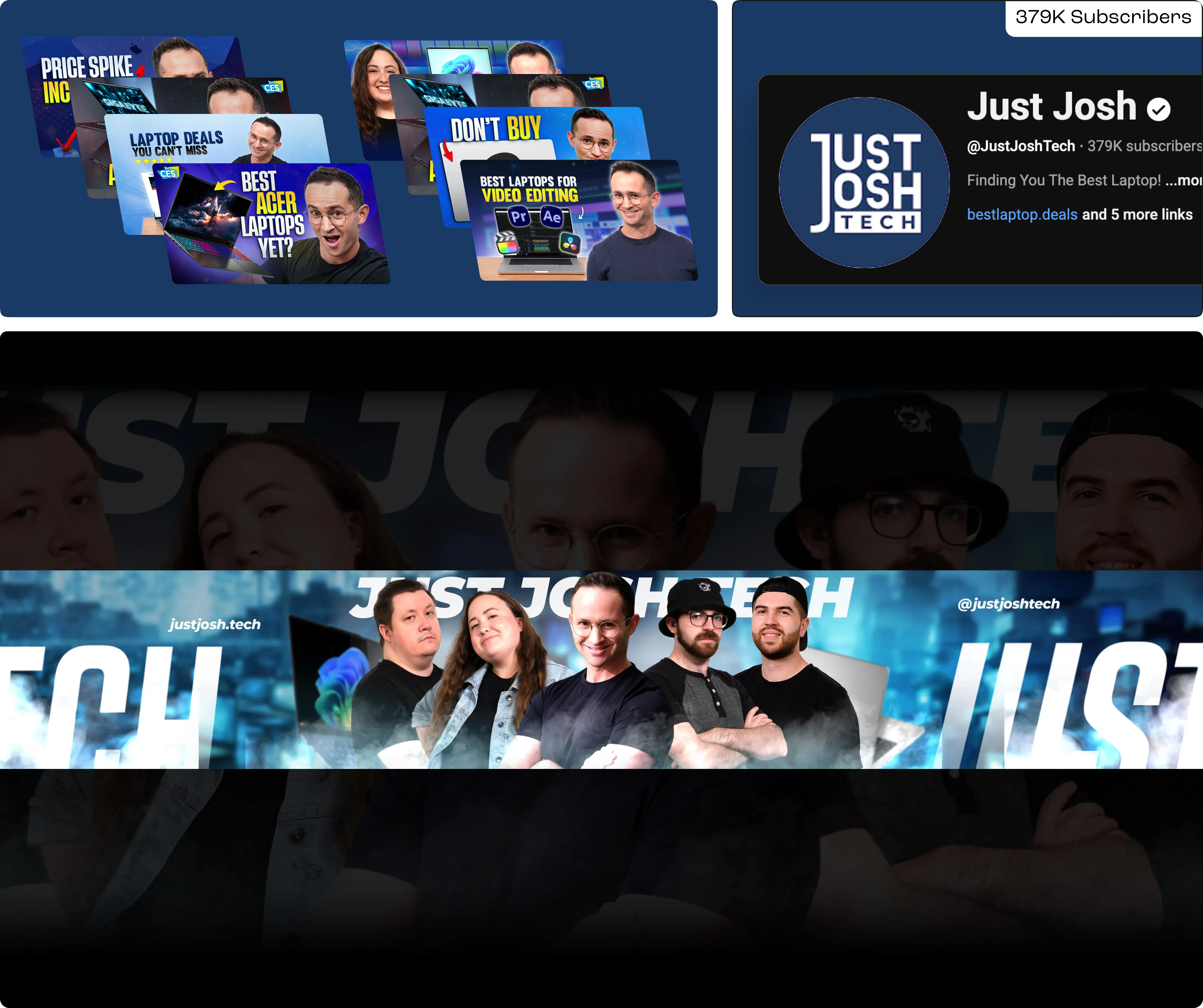
The objective of the project was to build a cohesive and scalable brand identity for Joshua van Aalst, an American YouTuber known for laptop reviews, and his broader online presence under the name Just Josh. Studio Posty was responsible for designing the core brand identity for Just Josh and its sub-brands: Just Josh Tech (378K+ subs) and Just Josh Biz (8.6K+ subs), while ensuring each retained its own distinct personality. Alongside branding, we also handled ongoing thumbnail and graphic design to support his YouTube content and digital platforms.
Visual Identity & Logo Design
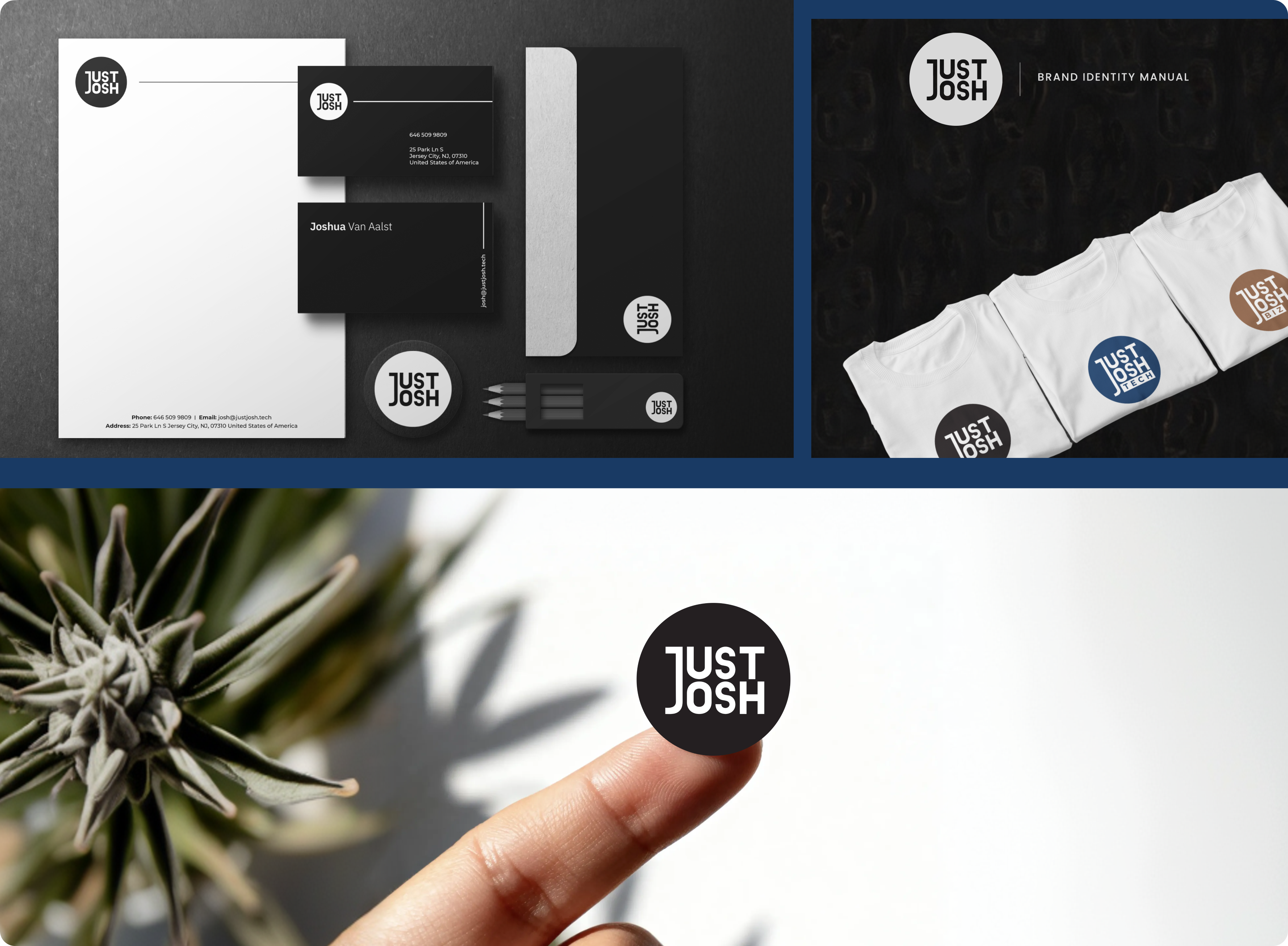
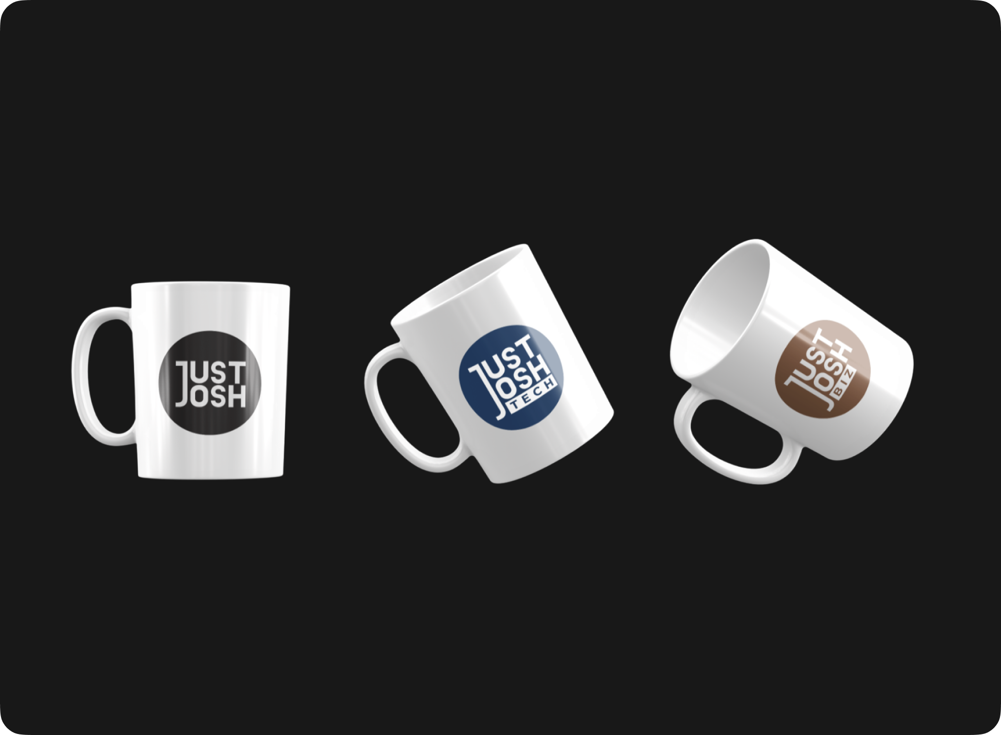
The primary Just Josh logo features an elongated “J”, designed to subtly represent Joshua himself being at the center of the brand. For the sub-brands, Studio Posty extended the same wordmark system while introducing slight variations to create distinction. Just Josh Tech follows a linked wordmark style with a clear focus on tech content, while Just Josh Biz adopts a similar structure but with a more business-oriented identity. Each sub-brand was given its own color palette to ensure quick visual differentiation while still feeling part of the same ecosystem. The overall direction was kept minimal and aspirational, allowing the brand to feel timeless rather than trend-driven.

Brand Book Creation
To ensure long-term consistency, Studio Posty developed a detailed brand book covering all aspects of the visual identity. This included primary and secondary logotypes, clear usage guidelines, spacing rules, and incorrect usage examples to avoid inconsistencies. The document also defined the brand color palettes for each vertical and established the typography system to be used across digital assets. Mockups were created to demonstrate how the brand would translate into real-world applications
Thumbnail Design
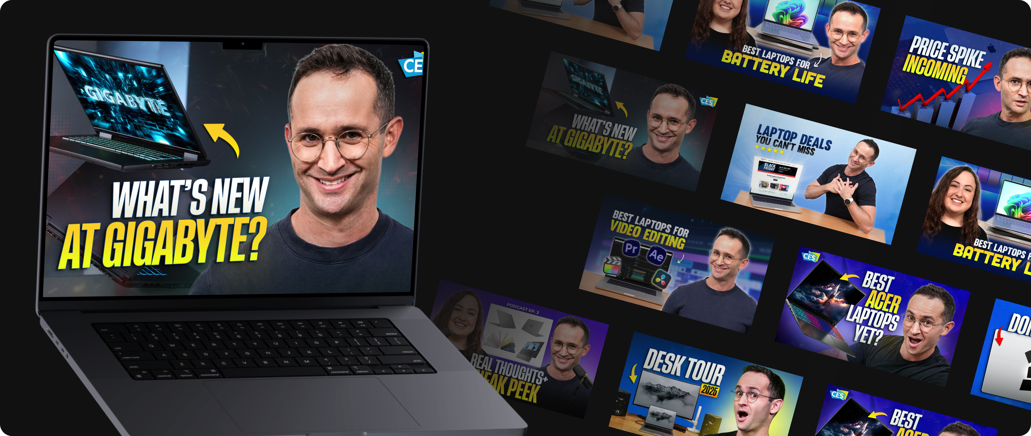
Studio Posty has designed over 200 thumbnails for the Just Josh YouTube channel, forming a key part of the brand’s visual presence. Each thumbnail follows a consistent design language while still being tailored to the specific video topic. The process involves selecting strong subject frames, combining them with bold and readable typography, and using contrast-driven color treatments to ensure visibility across devices. Elements like facial expressions, product highlights, and directional cues are used intentionally to guide viewer attention. Over time, this has led to a recognizable thumbnail style that stands out in the tech space while still evolving with the content.

Project Conclusion
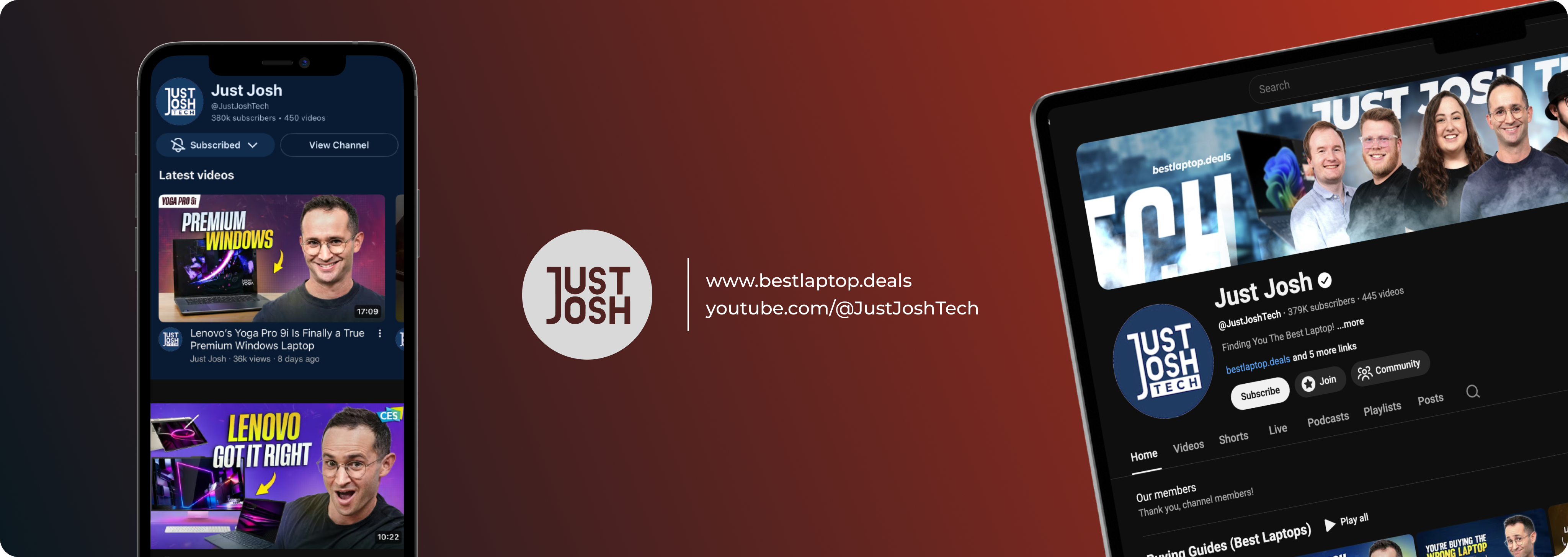
The unified identity across Just Josh, Just Josh Tech, and Just Josh Biz has made it easier to expand into multiple content verticals without losing clarity. Combined with consistent thumbnail design, this has strengthened the channel’s presence, improved visual recall, and supported continued audience growth. The result is a brand that not only looks cohesive but also performs: building authority, trust, and long-term value across platforms.

View More Case Studies
Try throwing the pills around
It's Time, Let's Create

|Mumbai, Delhi
Studio Posty | © 2026 All rights reserved.
created by createxp